O’Hare International Airport - Mobile Design
UX/UI Design | Spring 2023
Objective | Create a cohesive mobile design for the O’Hare International Airport. Take detailed flight information and organize/display it effectively using typographic and tabular hierarchies.
My goal was to make the overwhelming amount of detailed flight information legible for those who read it on their phones, and I made sure the design was simple and easy to use.
Organization & Creating a Hierarchy
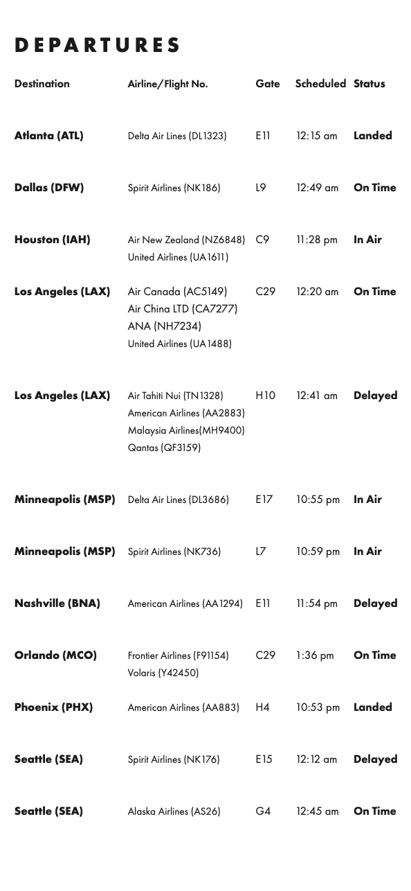
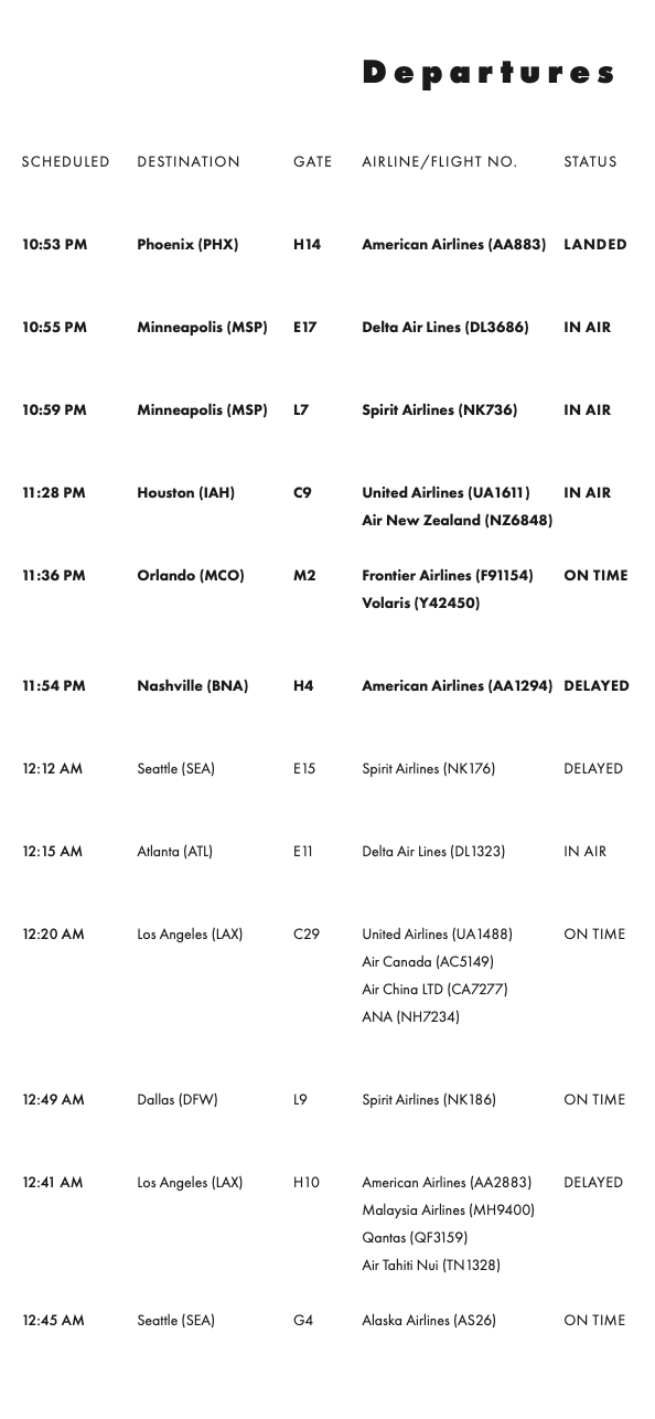
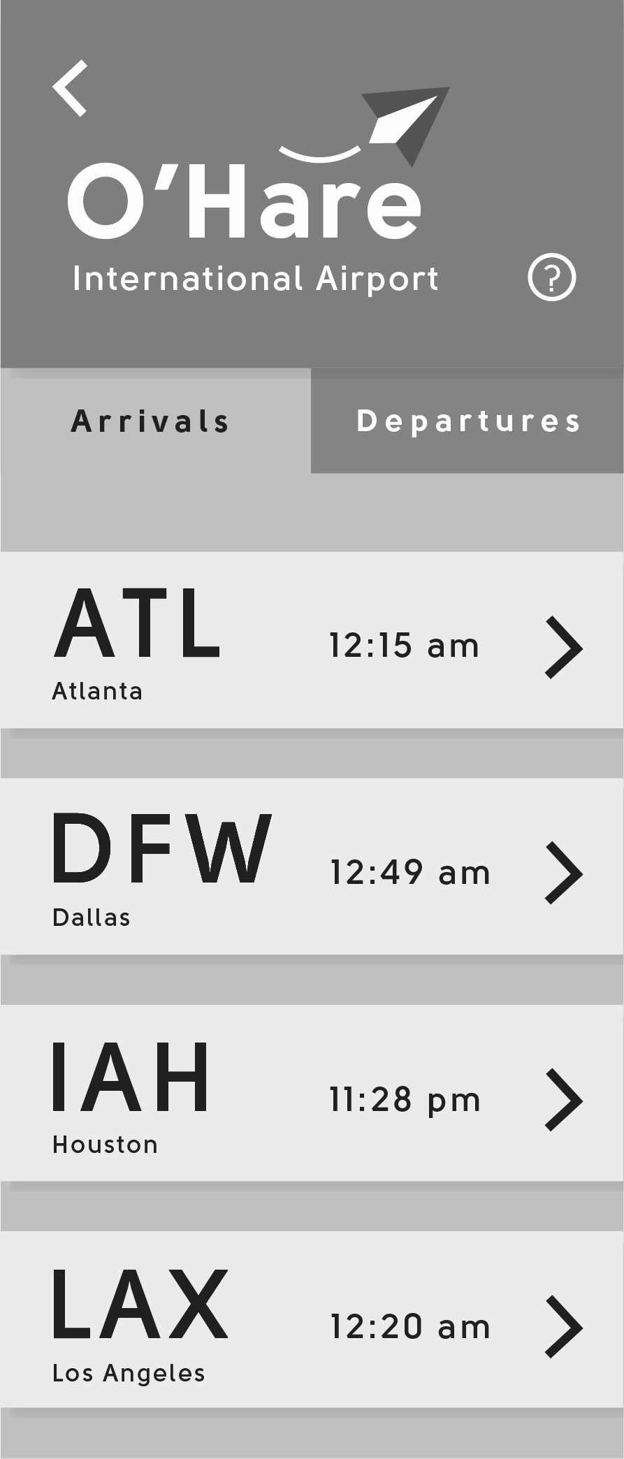
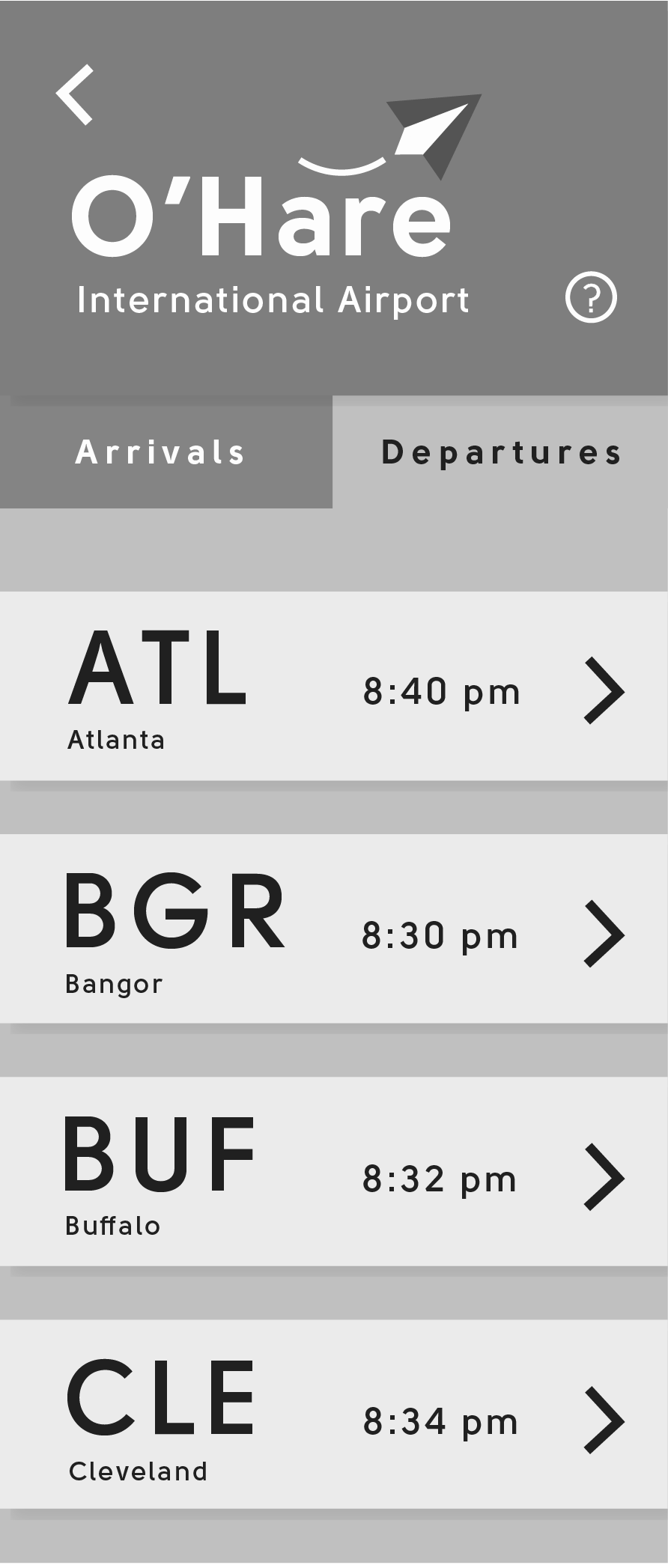
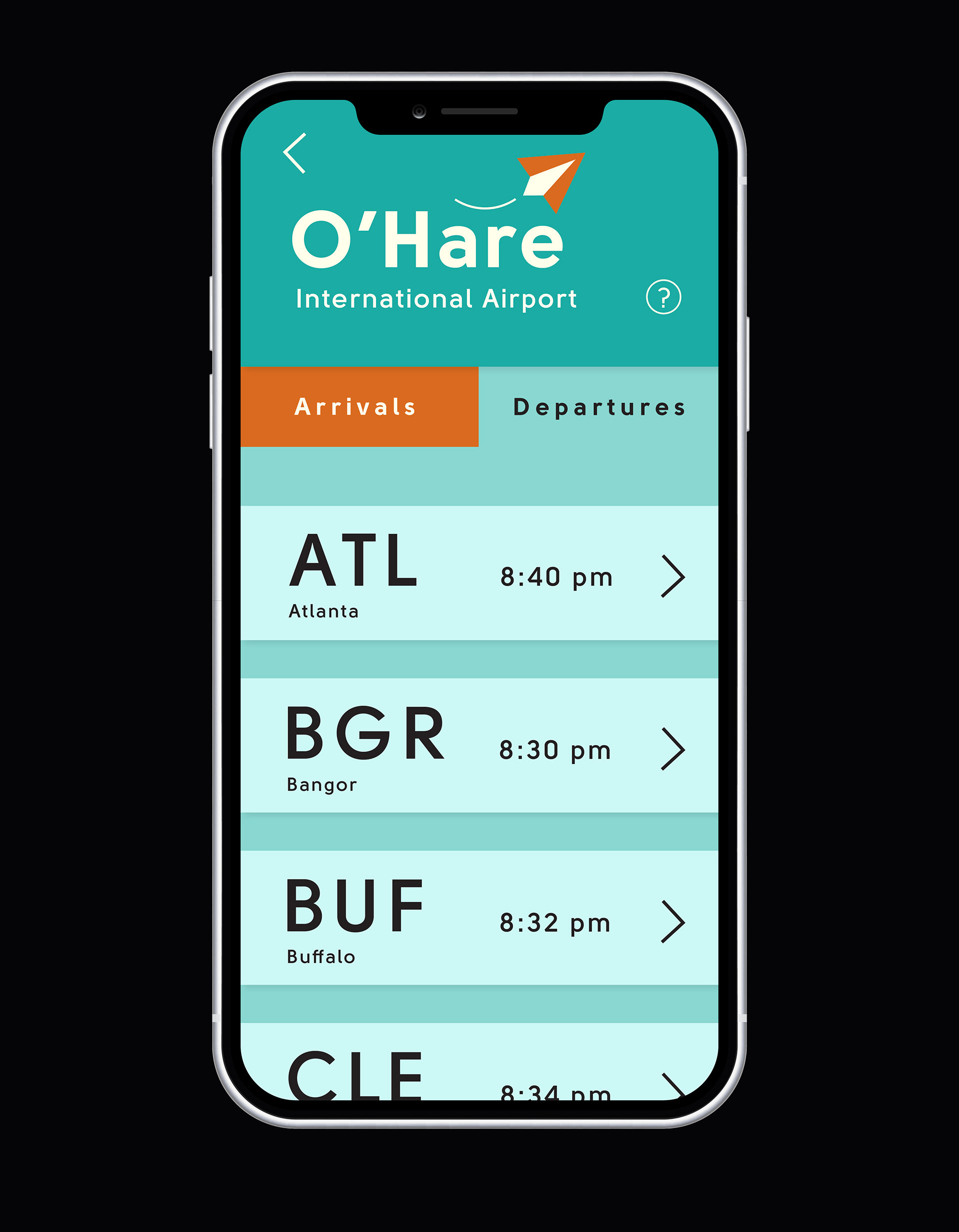
The first step was organizing the flight information. Listing the flights alphabetically by the airport was the easiest way to find a specific flight. If multiple flights were in the same category, I organized them by their departure/arrival time.
Picking a Typeface
The type had to work at multiple scales. As someone who doesn’t have the best eyesight, making sure it was readable was very important to me. I tested the typefaces on a phone to see how the final text sizes would affect legibility.
Layout Explorations
Early Concepts
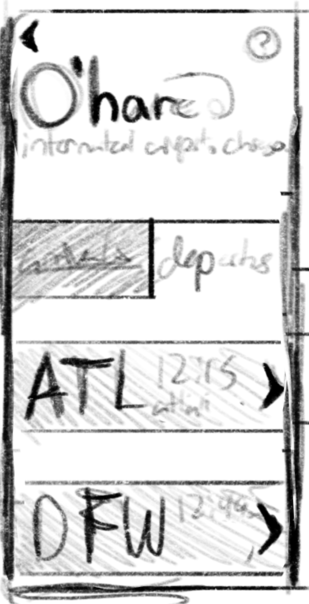
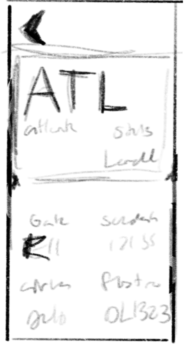
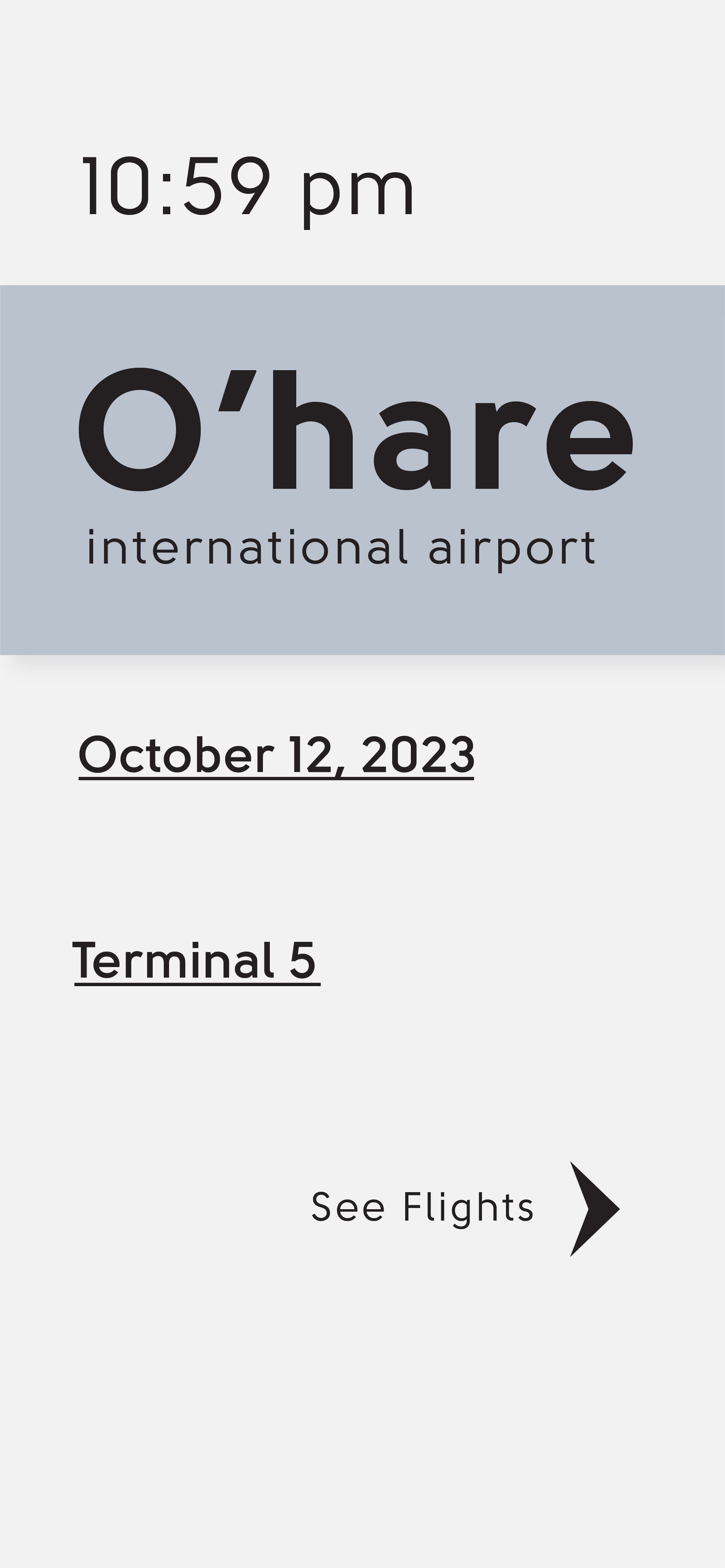
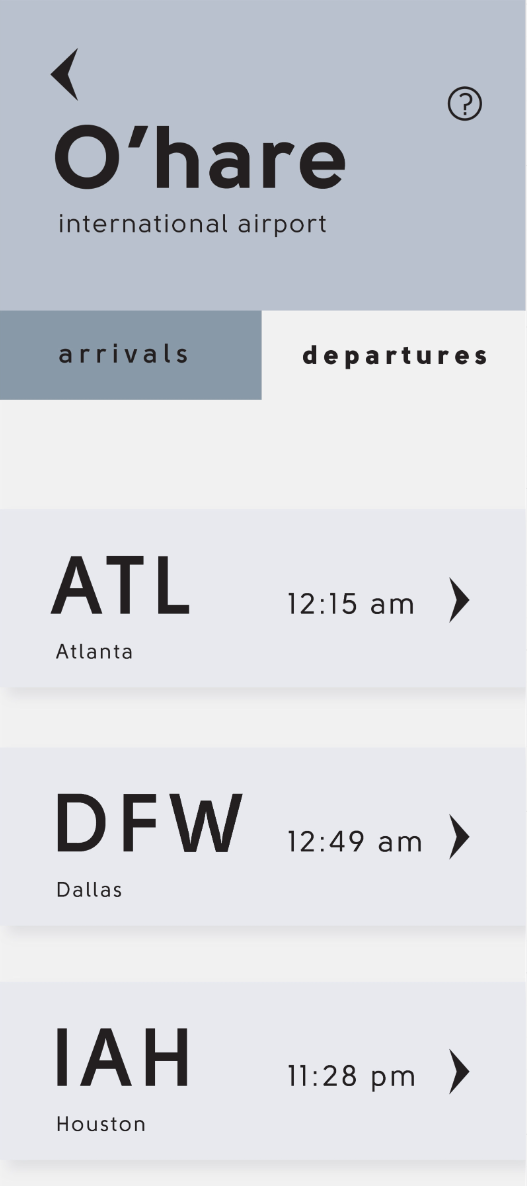
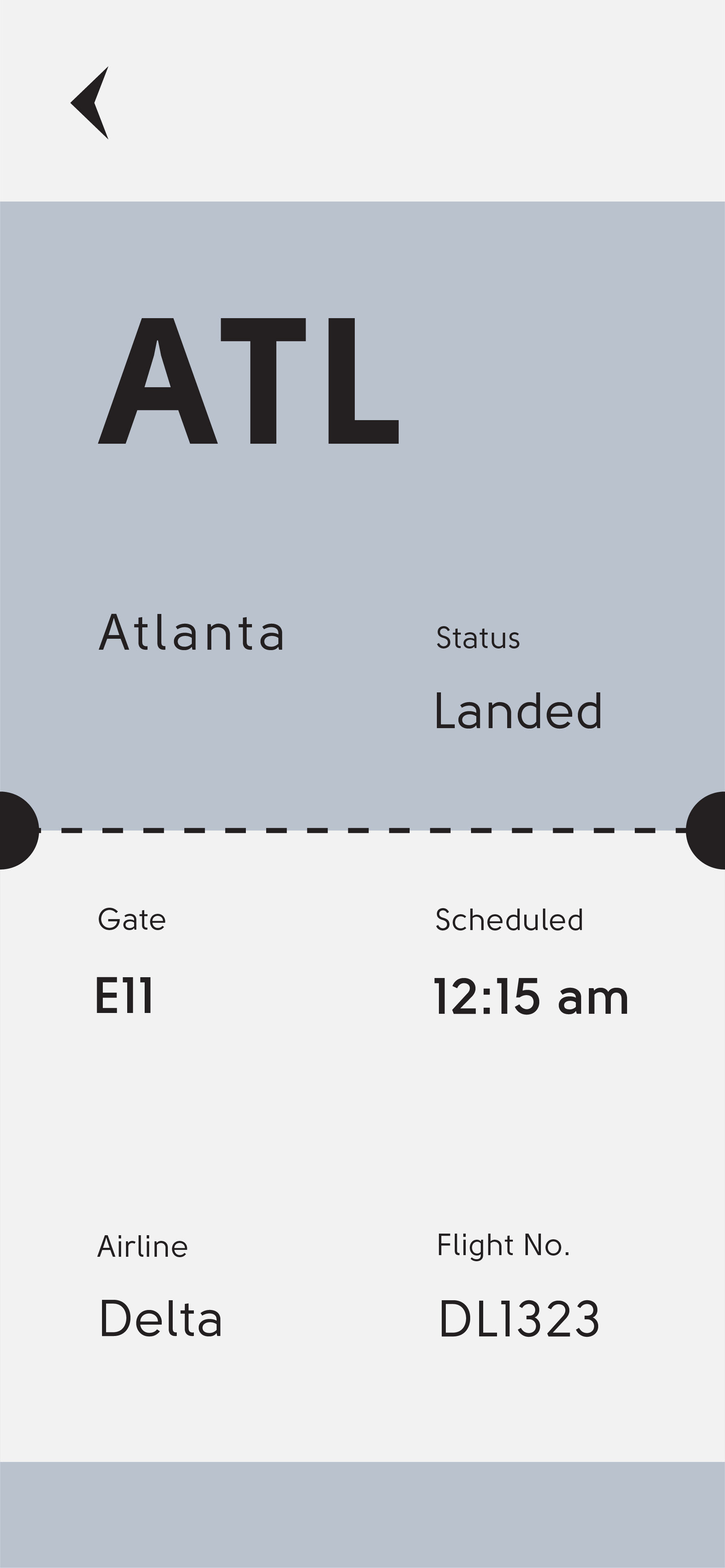
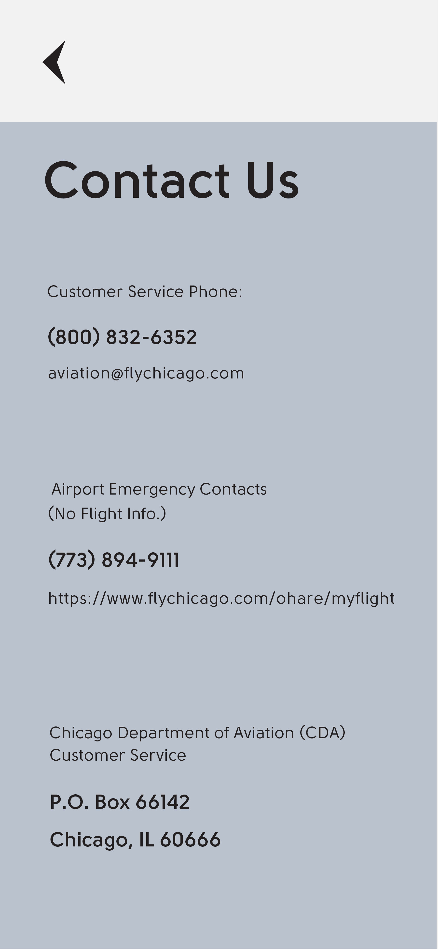
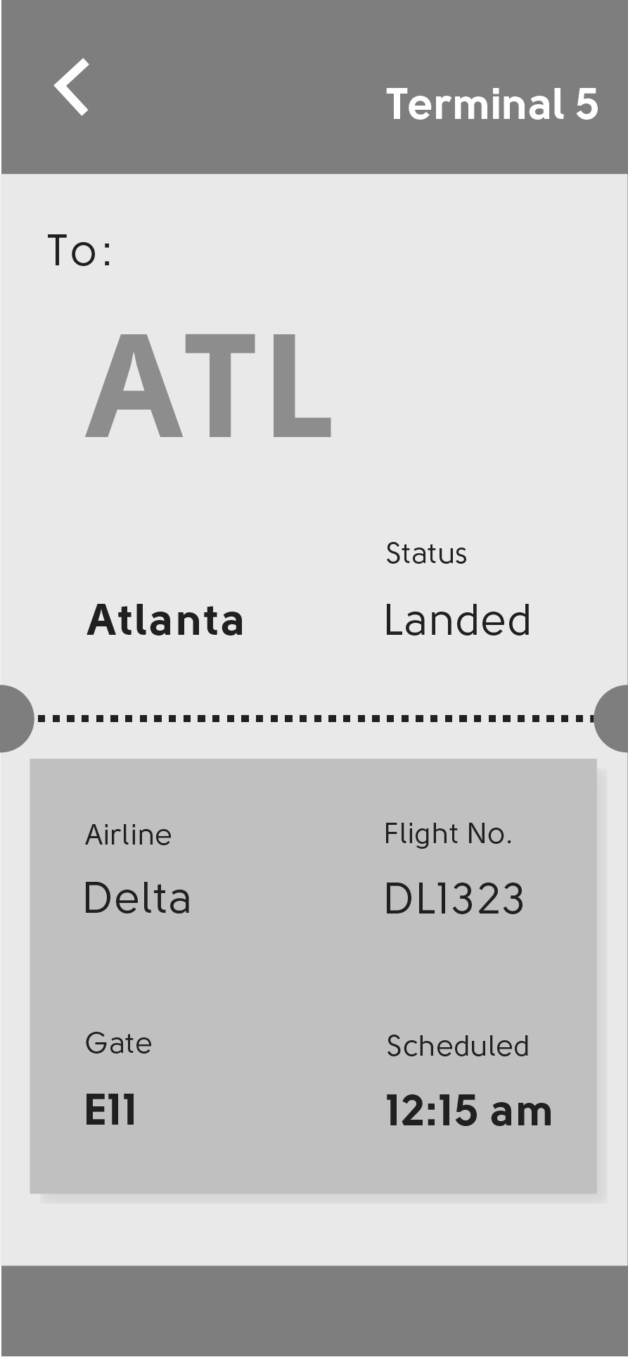
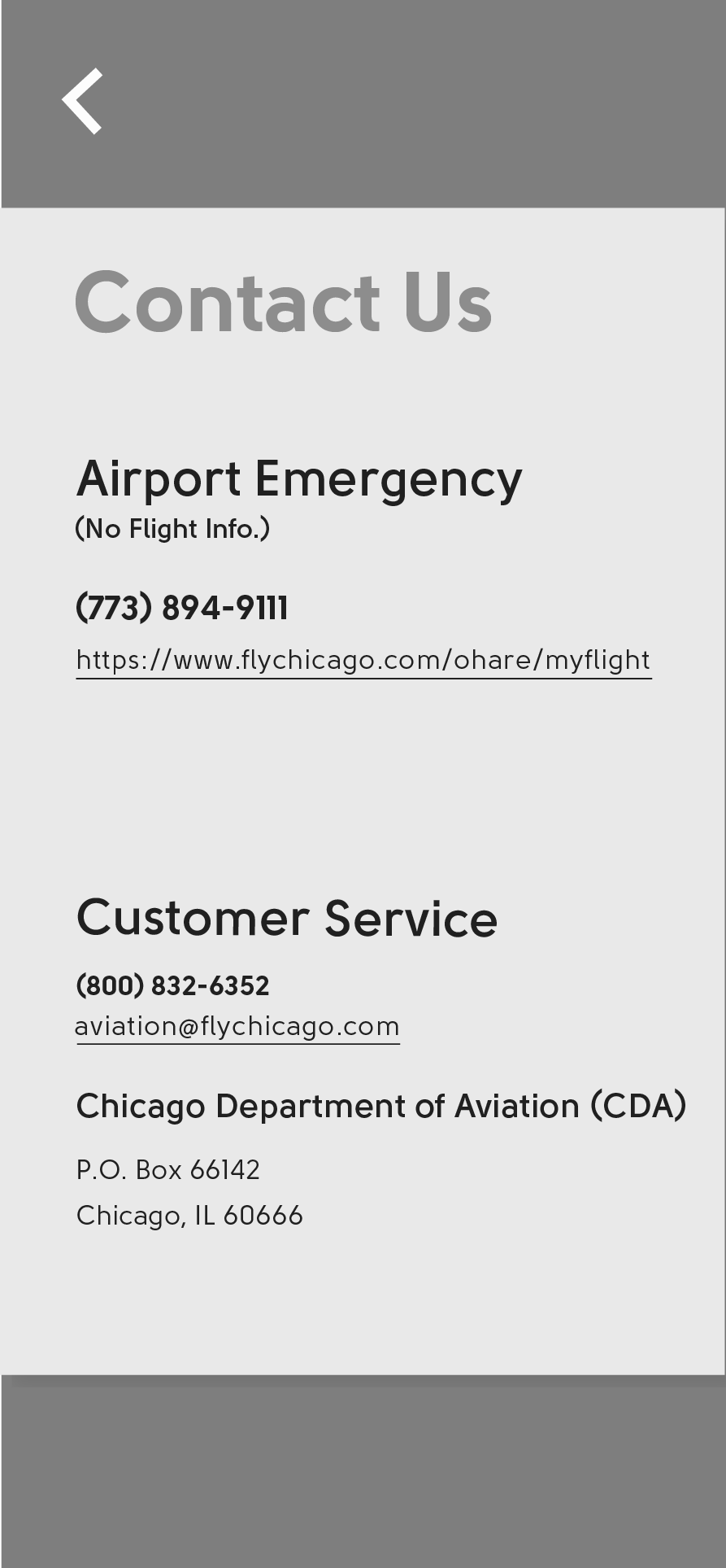
At this point, I began laying out the information on multiple screens. I was still testing the designs and ensuring they were simple to understand from a user perspective.
Final Wireframe
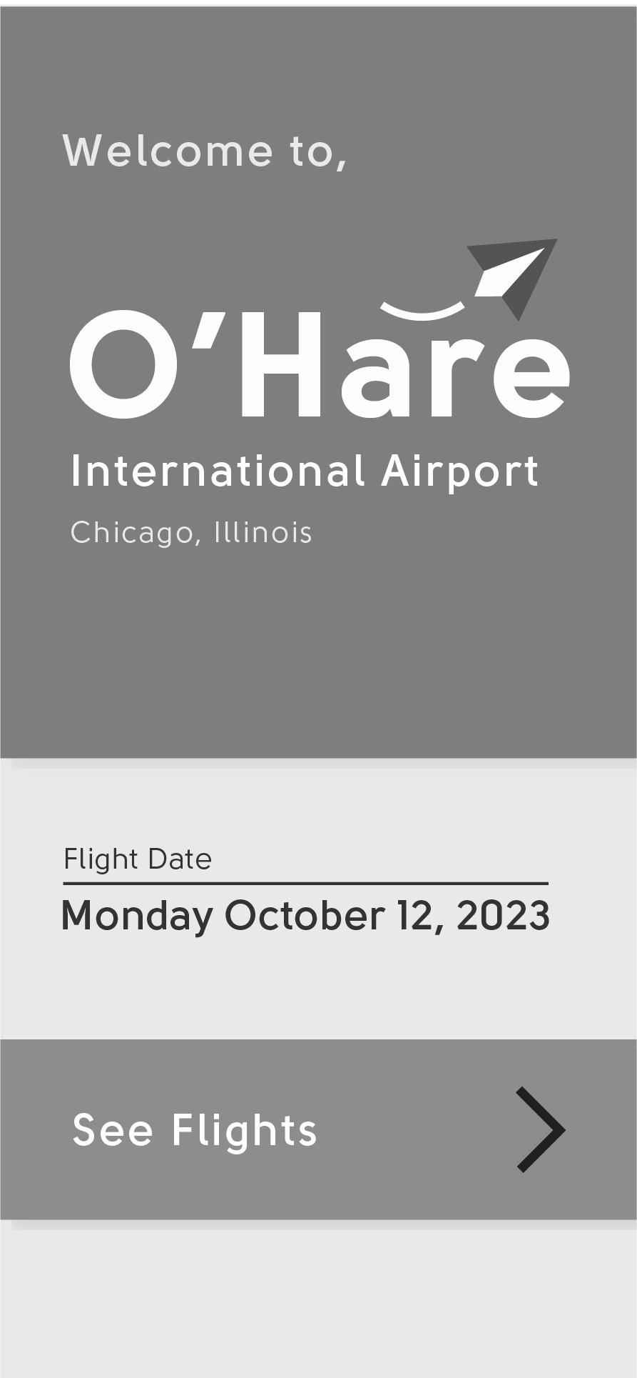
Calming Colors
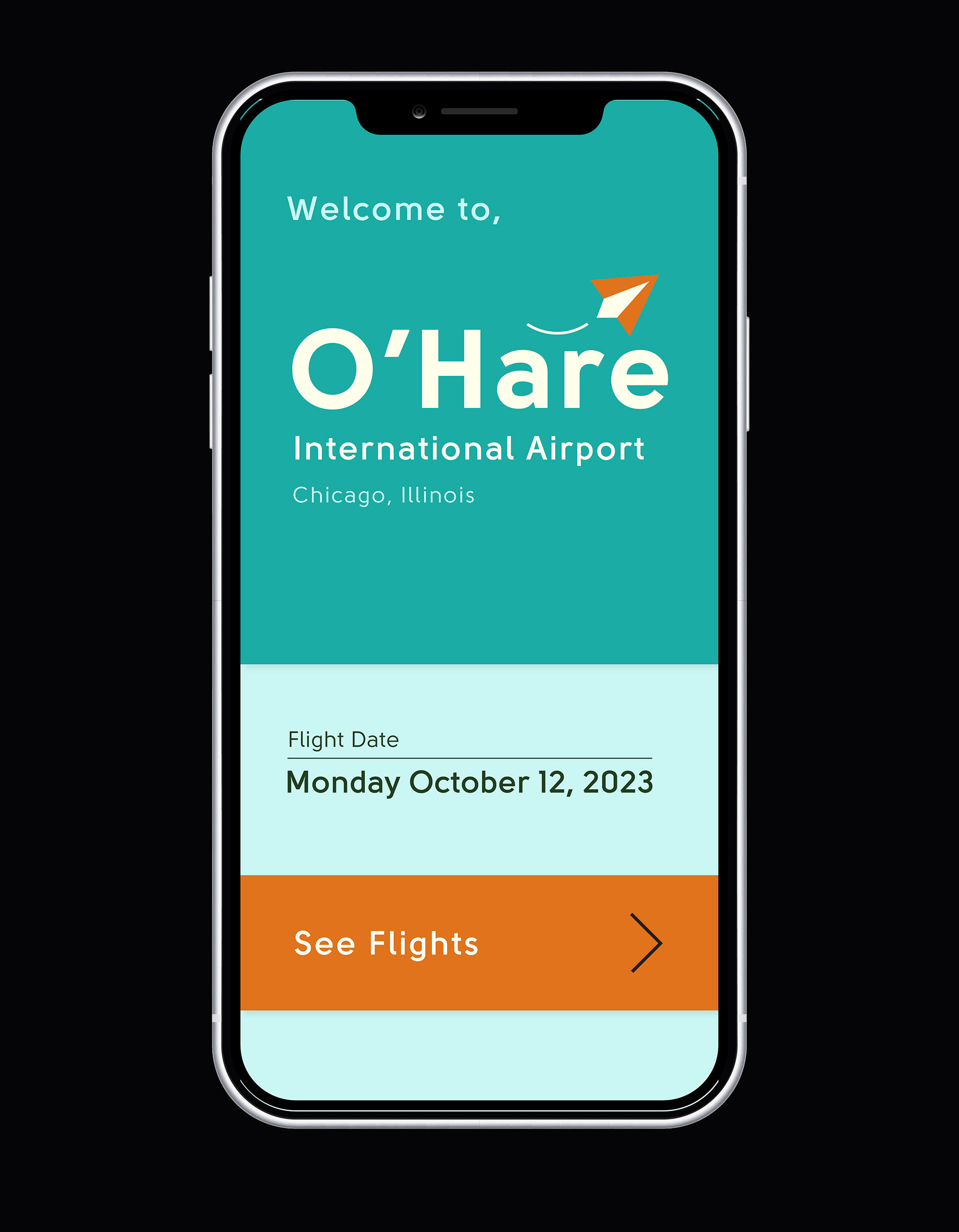
I wanted the colors to evoke a sense of calmness. The final pallet has a monochrome pallet with a teal color, using orange only to highlight certain key features.
Final Design & Prototype
Home Page
Arrivals/Departures
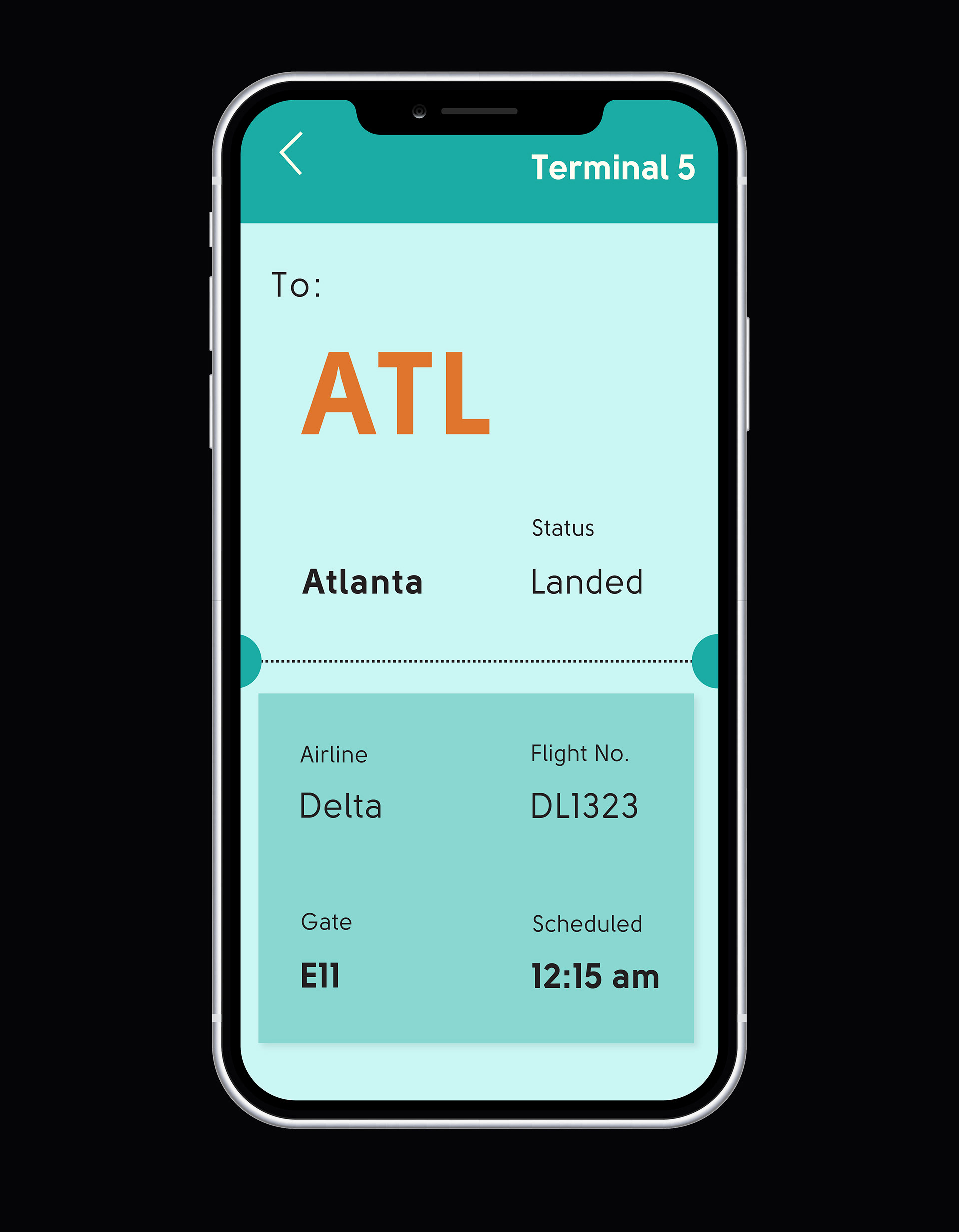
Detailed Flight Info.
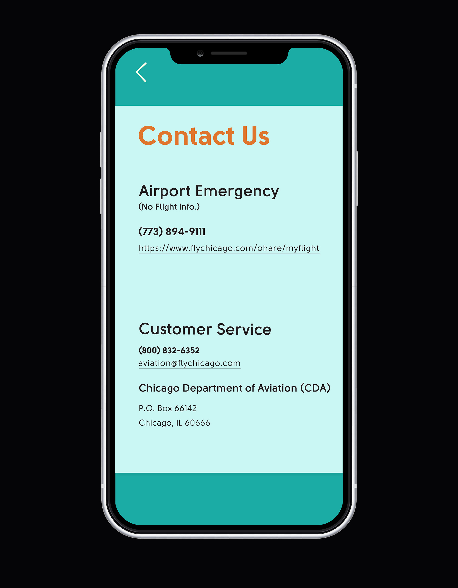
Emergency Contacts
